Tickets to Connection
Helping people connect over long distances through art.
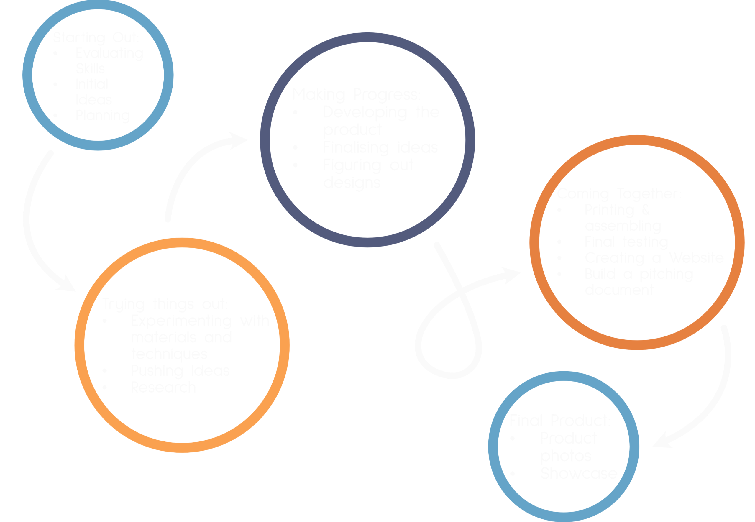
The Development Journey
1. About the Project
Overview
For my project, I wanted to create something that encourages connections and conversation through art. Inspired by myself and my partner being in a long distance relationship, I created a deck of cards that feature art prompts and conversation points that get users making art and talking to each other.Note: All the goals and plans on this page were written at the very start of development, so they differ a bit (or a lot) from my final product as my idea evolved.
What is this website for?
This website is to show my journey through creating my final major project; from initial concept to the final product. It explains every step I went through in development, although some go into more in depth than others, depending on how new the skills were to me or how much time I spent on that stage.
What are the goals of this project?
The main goal of this project is to develop a platform to help people connect over long distances using art whilst showcasing my digital skills in graphic design.To do this, I will design a deck of digital cards that are available on a website and an app. These cards will feature art prompts to give the users an activity to do whilst on call together. The prompts will be supported by suggested conversation points or questions to help the users talk to each other, guide them towards deeper conversation and take them on a journey to connect with each other. Users will have a digital account used across an app and website that allows them to sync the cards they acquire, create groups to share the prompts they own, maintain a private gallery of artwork completed for the prompts and track achievements with digital badges.Altogether, this will provide people in any kind of distance relationship the resources to complete creative, offscreen activities together whilst encouraging conversation and the space to connect.
Why is this project important to me?
My partner and I have been in a long distance relationship for over a year, and have been trying to find different things to do together. We have found that there is nothing to do beyond consuming media together and playing video games, but even then there is only a limited number that encourage you to work together and not just wander off in opposite directions. This is why I want to create something that can be used by people in long distance relationships and make the experience slightly more bearable.Communication and connection is very important to any kind of relationship and any kind of relationship can be separated by distance, whether it be family relations, romantic relationships or even friends, so I wanted my project to extend to those groups too. I also have a group of online friends, and now spend longer periods of time away from family, so I understand this area of connection too.
By focusing the project around creating art, it gives people something to do, which is one of the hardest things to do over long distances. By using an art prompt, everyone involved can work towards the same goal and the joy of doing something together. Everyone will, however, end up with something slightly different and this is an excellent way to get people talking to each other. I want to get people talking because communication is very important in building healthy relationships and creating good personal wellbeing. Art is also an excellent way to contribute to wellbeing and is something I would like to explore with the increasing research in art therapy and other uses of art in building good mental health.I want to take on a project of this scale so I can showcase as many of my skills as possible. Expanding a small idea of art prompts on cards into a full product is a great challenge that involves lots of different skills and various forms of media.Finally, I want to end up with a physical product because I want to hold onto physical media. The ability to have a physical object to hold when you have made a purchase can be important to some, and it would also be beneficial to the showcase at the end of the year. It also gives me the opportunity to explore and develop more skills.
Who is this Project for?
Tickets to Connection is for anyone who wants something to help them stay connected and have an activity to do with people they care about when they are separated by distance. This could mean online friends, long distance couples or families spread across the world. Tickets to Connection aims to be accessible regardless of the situation and the reason for the distance. It also can be used by groups in person as an activity to get talking to each other.There are limited activities to do when you can’t be someone in person. Tickets to Connection is for people looking for an activity to do whilst on call together. It allows for interactions and quality time without being completely tied to a screen. This makes it better for reducing screen time, sharing a device when calling loved ones and allows for the creation of physical pieces of media and therefore more suited to a much wider audience of people.Tickets to Connections goal is to get people connecting, it's for people who want to build strong connections with those they care about. The unique addition of related talking points supporting the art prompts makes it easier to start talking, whilst being able to make art removes the pressure away from the conversation. Because of this, Tickets to Connection will also be beneficial in wellbeing spaces, allowing people to open up about their experiences at their own pace in a safe group setting whilst creating art.
How Will I Complete the Project?
To complete this project, I will create:
A deck of cards featuring prompts and conversation points.
Visual design, concept and mock-up of an app and website that allows users to acquire and use the cards as well as provide related services and bonuses such as achievements.
Branding and brand guidelines for the project.
Establish a social media presence for the project.
Plans to set the project up as a business and space to expand.
Additional, but not essential things i want to do:
Advertisement for the project.
A physical deck of cards.
Packaging design for physical cards that takes into account user needs and sustainability.
To reach a finished product I will go through a cycle of research, experimentation, development and testing. Going round each part until I reach something that is high-quality, and I am satisfied with. Unfortunately, I am the sort of person who will always think something can be better.
At the start of my project, I am going to do in-depth research into the positives of art in wellbeing, as well as how art can promote communication. This will give me guidance in adding the discussion points to my cards. I will also explore similar products and existing prompts lists to get inspiration whilst making sure my product is unique.When moving on to development there are some areas I will be more confident in, for example the graphic design, whilst there are others I have little to know experience in, such as 3D modelling and printing. I want to experiment and push my skills as much as possible whilst still making sure I keep on track for completing the project on time.Throughout the development of my project, I am going to put it to the test, with my partner and my online group of friends. First, I will gain feedback on just the concept of the project from my peers, ensuring to get feedback from online friends. As I progress through development to where I have a prototype, I will test the project with a small group of my online friends and ask them to try it with other friends to get more in-depth feedback. I will know I have succeeded when I have a product, with all my deliverables, that completes the purpose of giving people in long distance relationships something to do together and build connection.
2. Starting Point
Skills Audit
To begin the project I created a skills audit containing all the skills I have gained throughout my Higher Education and experiences during this timeframe. For me this consisted of 4 years of modules, from 2 different universities, which makes it quite long. So to read it click the button below.
Coming Up With An Idea
Mind Map Of All My Ideas
I knew going into this project there was going to be a lot of brainstorming, and therefore a lot of mind maps. Instead of handwriting them, and watching them slowly become more and more illegible, I decided to use an app called Simple Mind to make them.

Choosing An Idea
I started to become very attached to the idea of making the card game with art prompts; thinking about what I could do and how effective it would be for people in long distance relationships, myself included. Although I feel some passion for making a Think Bike campaign and some personal connection and animating to music was my idea for my final project earlier in my time at university, I kept being drawn back to the cards. So I decided to go with that idea. The personal inspiration and connection makes me so much more passionate about working on the project and giving it everything I can give.I expanded upon this idea to be less of a card game and more of a tool for people to use making art as a way to build strong connections and healthy relationships.
Project Mindmap - what can I do?
With my idea chosen I wanted to get down every possible thing I could do as part of this project to see what skills I could cover, new things I could learn and how to make a high quality product.

Inspiration - A Mindmap
Every time I found or was suggested a piece of inspiration, I put it on this mind map. This then became the base of my research.

Defining the Outcomes
This project has a lot of potential and many possible deliverables, however I need to be realistic in what I can produce in the time frame. This is the minimum I want to achieve in this timeframe that I feel is achievable whilst still pushing the potential.Main Outcomes:
Deck of cards featuring art prompts supported by conversation points
Interface design and high fidelity mock-up of the website to show how users acquire and use the cards.
Interface design and high fidelity mock-up of the app to show how users acquire and use the cards.
Branding for the project including logo, typefaces and colours displayed in a set of brand guidelines.
Marketing and online presence for the project.
Plans and concepts to progress the project to be a viable business and areas where the project can expand.
Additional Outcomes:
A physical set of the cards
Packaging to compliment the cards that take into account user needs and sustainability.
Concepts for additional products such as stationery, stickers etc.
Project Proposal
I completed a form about the proposal covering what my project is, why I want to make it, who it is for and how I plan to complete the project. I also outlined a brief, matching my deliverables to the learning outcomes of the project.


Peer Feedback


I explained my project idea to my peers on a Miro board to receive feedback. I also provided feedback on other peoples projects.It was reassuring to hear that my project was unique and that it would meet the needs of the target audience. I understand that the prompts and communication points need to create a path towards an end goal of the conversation topic and my feedback highlights this.The idea of tarot card sizing is something I might consider as I plan to look more into design, layout and size of different cards however currently tarot cards seem more impractical as they are much longer which would be more more difficult to display on a variety of screen types and if they were to become physical printed cards would be a lot less practical for users to store, carry and use.It is unlikely that it would be possible to combine cards due to the prompts being longer and fairly specific in nature to allow users to have the art reflect themselves but replayability is something I do need to keep in mind. There needs to be a reasonably large number of different cards so that prompts are not needed to be repeated quickly and that the prompts can be completed again without feeling too repetitive. Getting suggestions from social media for prompts would be a good idea because I would be able to get suggestions and feedback from the target audience. I think suggesting people share what they have created on social media would be good, but having it run completely on social media would make it harder for people to be more open and personal in their art, diminishing the purpose and outcomes of them using the project. It would be good to include extra challenges on the card to modify the prompt as well as modifiers that make it more accessible if necessary but this might be difficult with the space I would have on a card, although the cards being digital might still allow this to be possible. The conversation points will encourage the users to move out of their comfort zone too. I do want there to be little badges that can be earned from completing sets or a certain number of prompts and this would be fun, engaging and a good way for users to compare their experiences without having to share more personal things such as drawings. These will be accessible in the sense that it won’t require social media posting, be in a certain size group etc for the main set.The activities are designed to be done on your own whilst on voice or video call with the person/people you care about, then you can answer the conversation points whilst creating art, after creating it or can have your own conversations. Although they are still just art prompts, meaning they can be done in person, collaboratively or alone before you call those you care about. They have a variety of uses outside of their intended use. The cards will have a design on the back that makes them identifiable to the project brand, the front listing the prompt will most likely be just text so it is easy to read and understand, however I might include a small illustration in the corner or similar to make it less boring. I will need to explore layout and other things before digging into the exact design of the cards.
Target Audience and the limits is creates
My target audience is anyone who can’t be with someone they care about physically. The initial inspiration was long distance couples, however, I know more people could benefit from a product that makes video calls far more fun and meaningful. This could be families living across different countries, online friend groups spread across the world, people with loved ones in hospital, people separated by friends and family in the military and a whole other load of scenarios.However, this does create limitations on certain aspects of the project, to make it as accessible as possible to all those groups. For example, those who are in a hospital or in the military might not have access to many resources or other locations. I need to keep this in mind when developing the prompts.
Personas
I created some personas representing my target audience. I made them specific to my project, making sure to include the aspects that would most reflect their interest in the project. By understanding why they would be interested in a product like this and what they would use it for will be useful in guiding decisions during development and how the final outcomes will look. Given the target audience is broad it was hard to cover all potential consumers, but I tried to cover the major age groups and situations.


The Learning Curves
The only time I have taken a concept to a final product was for my GCSE coursework, where we had to design and make a CD case. This was of course very structured, with an already decided end goal, weekly tasks and very little space for experimentation, meaning I didn’t learn how to manage the project myself and the whole project was a much lower level. Furthermore, I have never developed an app or website with such detailed functionality. The platform involves far more than navigating between a few different pages.However, I know I have the potential to complete the project because I have all the foundation skills for all the elements of the project. I have strong graphic design skills and an understanding of UX and UI design meaning I can build on this to build a thorough mock-up of the website and app to clearly convey my idea and test the concept of the project. This means that even if I cannot develop the app, with my limited software development and coding knowledge I have the foundations to get it fully functioning in the future.The project is difficult and has a lot of different elements that need to come together but I know my passion and personal connection to the project will help me maintain motivation in completing the project and drive me to overcome barriers.
Project Timline
I created a timeline to outline the production process of my project. I then broke this down into a week by week timeline to give myself an outline of when I should have parts of the project completed by. Obviously, as the project progresses things might change and the time I spend on a certain stage might need to change.I also kept a log each week to reflect upon what I had done, how things were going and how I was feeling. This covered more of my personal reflection on my progress instead of technical decisions.
Production Process
Timeline

Redefining my goals and outcomes
Since initially deciding upon my project, it has changed, developed and decisions are scattered about. So I decided to redefine my key goals, their importance to the project and how they will help me develop skills.
| Outcome | Reasoning |
|---|---|
| To develop an online platform and product that helps people communicate and connect over long distances. | • I know how difficult a long distance relationship can be and there is a serious gap in the market for things to help people separated by distance stay connected to their loved ones that I want to fill. |
| A prototype of a website for the project | • Will explain the platform and show how it would work. • Will show and develops my own graphic design skills. • I will learn how to develop a website in appropriate development |
| A prototype of an app for the project. Will show how the platform can also be an app | • Will develop and showcase my graphic design skills • I will learn how to use develop apps in appropriate development software |
| A set of art prompts supported by communication points that encourage people to communicate and connect. | • A fundamental part of the project that meets the core goal. • Encourages me to think outside of graphic design and expand my knowledge. |
| Branding for the project solidified into brand guidelines | • Will be important in advertisement and gaining funding for the project • I will learn how to build and brand • I will learn how to put a brand into a set of brand guidelines. |
3. Digging Into Research
What do I want to Research and Why?
I am aware of how important communication and connection, but I want to further understand the role art can play in communicating in a way that creates connections, encourages creativity and promotes connections.I want to research how communication and just talking to people can improve mental health to help show the importance of my project, as well as see what topics I should guide people to in my communication points. This is because I want to guide users to have meaningful conversations without being pushed towards topics that are too deep or serious, as I want this project to be fun and lighthearted, although users themselves might steer towards this conversation.I want to look at projects where people use different forms of media to communicate over long distances to see the different media people use to communicate beyond texts and phone calls.
Mental Health & the Importance of Communication
My project is built on the importance of talking and connecting with the people you care about to maintain that relationship despite being separated by distance, as communication is the foundation of a strong and healthy relationship; regardless of the type.To support this and the importance of this project, I looked into how good communication can improve mental health. I found that effective communication can improve “wellbeing by reducing stress and enhancing emotional resilience” (Hanger, 2023). Furthermore, being able to communicate needs and boundaries can make someone feel safer, more comfortable and boost self-confidence.Tickets to Connection encourages conversation, strengthening communication whilst having fun. The aim is to not force people to have difficult and deep conversations but give them the space to do so and the tools to build up to that level of conversation.
Mindful Art Prompts


It was important the prompts used in Tickets to Connection promoted conversation and got people reflecting and talking, so I had a look at mindful art prompts for some inspiration. These prompts are usually aimed at individuals, helping them reflect and relax, many of which I felt would be more personal than what users would want to share straight away. However, I found it helpful to see what sort of activities promotes this as well as the additional information of the goals that came along with this set of prompts. Furthermore, ideas for prompts that are more personal or more in depth will be useful for expansions where users are looking for that kind of prompt.
Past Projects Using Art & Media to Communicate
Dear Data
Dear Data was a project where each week two people, Giorgia Lupi and Stefanie Posavec, hand drew their personal data on postcards and sent them to each other across the Atlantic. They experimented with different ways to visually represent the data and approach data “in a slower, more analogue way” (Lupi and Posavec, 2016). The two artists don’t want to use the data to “become more efficient” they instead want to use it “to become more humane and to connect with ourselves and others at a deeper level” (Lupi and Posavec, 2016).I really like Dear Data using physical media in a world where everything is becoming digital and screen based. The idea of physically posting a postcard rather than just sending an email makes it far more personal. I want to get people making art with my project, to have physical pieces of art to send to each other or to have as a physical memento of the moment.
Vlogbrothers
Vlogbrothers is a YouTube channel started on 1st January 2007 for the purpose of hosting the Brotherhood 2.0 project. Brotherhood 2.0 is a project undertaken by brothers John and Hank Green where they only communicated via video blogs, taking turns to upload a short video to YouTube. The project lasted a full year, but by that point people had started watching their videos and so the project continued but shifted to each brother uploading once per week rather than every other day.The brothers now have a catalogue of every video on YouTube that they can look back on. A suggestion I could make for users of my project could be to keep a sketchbook of all the artwork they make with the people they care about to be able to look back.
Inspiration for the Prompts
The Art Assignment
You Are An Artist: A book to supplement the YouTube series of different art assignments that encourage you to be creative regardless of your skill, often with interesting approaches.The Art Assignment pulls together interesting works of art and processes from different artists. These artists then assign the viewers an art assignment relating to their own work or the work they have talked about. This gives people a way to create art, as often the barrier is not knowing where to start. These assignments are not what you would expect, as they are not “draw a still life” or “practice anatomy.” Instead, they include assignments such as “Meet in the Middle” where you and someone you know travel to the midpoint between your two homes and document the journey or “Emotional Furniture” where you arrange furniture in a way that conveys envy, melancholy and confidence. This more fun and abstract approach to art prompts is what I want to include in my project.What I like about The Art Assignment is that the goal isn’t to teach people difficult technical art skills, but to inspire people to get creative and learn about existing art in an interesting way. The assignments in the book often include ways to adapt the tasks to make it more accessible, and also gives some tips on how you could approach the project to get the most out of it. The book encourages creativity and making art regardless of skill level.
Wreck it Journal (and similar books)
The wreck it journal is a book filled with activities designed to stretch creativity and encourage out of the box thinking in a way that leads to the destruction of the book. There are other books that have a similar premise sometimes without the destruction of the book, such as The Pointless Book, The Time Traveller Journal and Diary of a Wimpy Kid Do-it-Yourself book.All these books include activities that involve standard household items in order to interact with the page in the book, often using just a pen to make shapes, write things down or draw. The Wreck-it-Journal occasionally requires a little more as the purpose is to change the complete state of the book, but overall the materials needed is quite low. Furthermore, despite the activities being the same in every copy of the book, they are so open that everybody who completes the book completes it in a completely unique and personal way. I want the prompts I include within my project to include, for the most part, elements that will be personal, be that about themselves or something from their daily life, giving them a chance to share it with the person/people they are connecting with.


Inspiration - A Moodboard
I made a mood board to create a visual representation of my research and things to inspire the creation of my project.

4. Trying Things Out
This entire section is not very linear. I jumped around between different things as I discovered new ideas, got peer feedback, or progress with one part led to me wanting to develop another. It covers early development, experimentation, and research in specific areas.
Coming up with prompt ideas

I know I am going to need a lot of different prompts so I wanted to get started on a list early on, so as I thought of prompts I could note them down as well as any communication points I thought of for the prompt.I used a google sheet because I could access it from any way whilst still being able to organise the prompts and even sort them to make sure none are repeated.
Organising the prompts


I started by coming up with some categories that I could organise the cards by. There were lots of things I wanted on the cards to help users if they would be able to complete the prompt. The first draft included a lot of categories, with each category having multiple classifications. This was becoming very overwhelming for me, and therefore would be confusing to the user.To do this, I thought out loud my ideas to a peer and talked them through my process of narrowing it down. This allowed me to see if the categories were confusing to someone else in real time and also get pointers on how to get the list as small as possible.I was able to reduce the list drastically, having most things be listed as yes/no for the category and identified by symbols, which are far more user-friendly.This process seems to be redundant at this stage, but actually makes coming up with prompts much easier. I want the prompts to be easy and accessible but knowing I can expand into more resource intense and longer projects in the future meant I could put those prompts aside. It also means once I come to the design of the card, I know what I am going to be needing to design and what I need to put on the cards.
User Testing - The concept of prompts & communication points
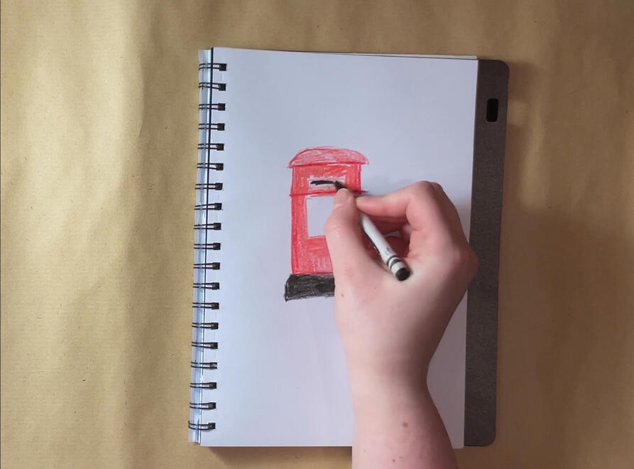
Draw something you see every day that's red
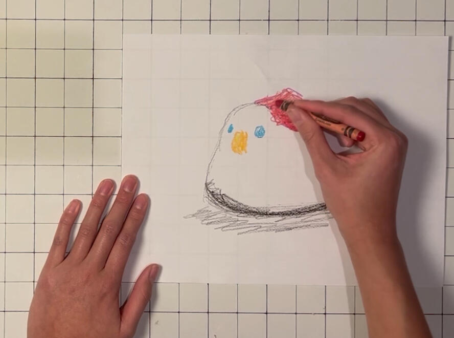
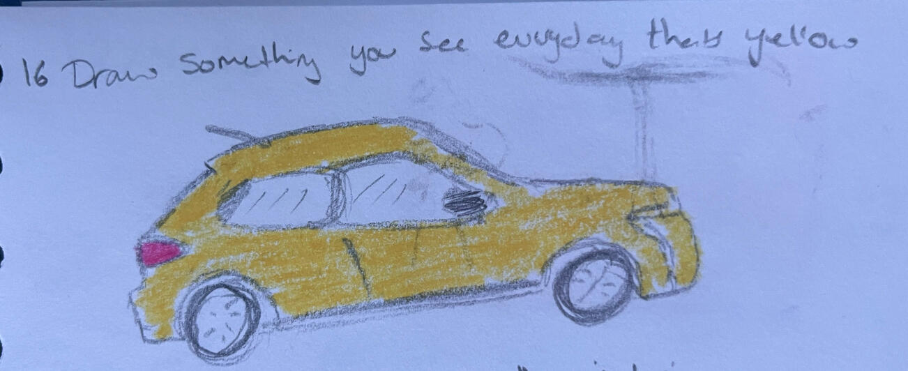
Draw something you see every day that's yellow
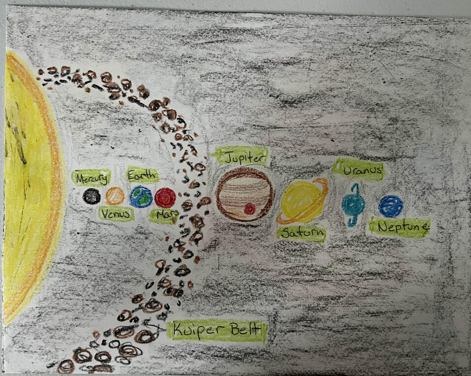
Draw the solar system, be as abstract or as realistic as you like
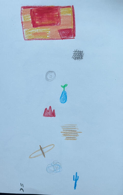
With a few prompts fully complete with 3 communication points, I wanted to test if the concept would actually be fun and engaging, and most importantly help with communication and connection.As we were the original inspiration for this project, I tested them with my partner, spending an evening call doing a few of the prompts. We did several different prompts, and it did keep us entertained for a couple of hours, especially as we let the conversations go off in tangent (the intention).I asked for one to be recorded to be used for my pitch, but most of the time we were just doodling in our sketchbooks. It added a little bit of structure to the call without needing to be too serious. Overall, it was a successful test.
#ThinkBigARU Pitching Competition
I decided to enter the #ThinkBigARU Pitching competition because I am really passionate about my project and want it to be an actual product. The initial entry required a business proposal, proposal for funding and a 1-minute pitch video. I have done small pitches during my studies but nothing to this scale and especially not looking for funding.I started by creating the pitch video, and I have done something similar before. I did some research and found the key points to include in a pitch. I found I needed to present the gap in the market or problem, the target audience and the goals of the project. I also found that the script for a minute-long pitch is only 120–180 words, which is not very many, so I need to figure out how to write my idea in a clear and concise manner.I got some feedback on the pitch from my peers when asking for feedback on naming the project, and everyone understood what the project was. The feedback was to add more on my personal experience and example images. I plan to include my experience in the written part of the form as it would not fit into the 1-minute limit, and I don’t yet have mock-ups as I’m so early on in development.I storyboarded my video to give me a vision of what I wanted to show and what it should look like, which was very important to me in getting my message across correctly. Whilst creating the storyboard I decided I should change my approach slightly, rather than explaining what the product is I should show how it works. This would help with confusion when others are trying to understand the project but did involve adjusting the script.I initially wanted to animate the video using stop-motion and live action for the demonstration. However, the amount of time I could spend on production and not having a good set up made me change my approach. I instead animated the assets in Adobe Animate using a mix of handmade assets and digital ones made to look hand made.I then moved on to the written parts of the entry. This was far more difficult as I struggled to know where to start. As this is a pitch for a project as a business idea rather than just a creative project, I needed to include different details in comparison to the usual way I pitch ideas. Despite the struggles of explaining how my business would make money whilst still telling a story, I feel as though this was a really good skill to develop more in my future career.After getting some feedback, including on the written part of my pitch, I ended up changing the name of the project to Ticket to Connection to reflect the project better whilst giving the opportunity to no longer call the cards “cards.” I then checked over everything before submitting the form.After two weeks of waiting, I found out I had not made it through to the next round. This was disappointing, but it didn’t affect my motivation to keep moving forward with the project. Furthermore, the competition is open to graduates, and I will try to enter next year even if I get help with the project, as teams can enter as long as one member is an alumni.


Naming the Project


Deciding on a name for this project was rather difficult. I knew I needed to decide on one sooner rather than later to stop whatever nickname I gave the project stuck as the name. However, I was incredibly indecisive, and it was the deadline for the #ThinkBigARU competition that forced me to actually make a decision.I started by brainstorming any related words and initial name ideas with the help of my peers and partner.I then pulled out names and wrote a list of names I liked. I narrowed down the list using my script for my pitching video, reading through it over and over, each time using a different name. This process also allowed me to practice reading my pitch. This allowed me to get down to just 3 names; Creative Connections, Tickets to Connection and Ticket to Creative Connections (a combination of my 2 favourites).I then asked a few of my peers if they had a preference for either name, or any other suggestions I should consider. It was a mixed response with some liking creative connections to other art with a distance, some thought a more sophisticated name meant whilst others suggested it be more catchy. This actually resulted in making it harder to choose.At first, I went with Creative Connections, as it seemed to well represent the project and not create assumptions around specific target audiences or limitations on what the product could be used for.During the process of entering my project into the competition, I changed the name to Tickets to Connection. Initially I didn't like the name because I felt it implied the need to travel, or the reason for distance is something you can choose to travel across to visit for example. However, my perspective shifted by starting to call the cards tickets, and focusing on the journey the users take using the prompts to become more connected, they are their tickets to connection.
Looking at other cards


For inspiration for my cards I decided to look at Trading Card Games (TCG) and Tarot cards, these were often bigger or contained more information than standard trading cards.Looking at TCG cards, I found that most cards are standard 63mm by 88mm which allows for enough space to include all the necessary text whilst still being readable. Smaller Japanese sized cards like Yu-Gi-Oh tend to be harder to read due to the lack of space, which for my project would make it not very accessible for users. The standard size for tarot cards is 70mm by 120mm, giving more space than the standard card. This space could be more useful, but overall would more likely be impractical. I want the cards to be convenient for the users by not taking up much space and be easy to store or carry around. There are many options to store standard TCG cards, but if I went with tarot cards, users would be forced to use the original packaging. Although I want the original packaging to be high quality and have added value, some users may just want to carry around a small selection of the cards.Some TCGs have full art cards, which can often make reading the text on the card difficult. In TCGs this is less of an issue because the full art cards are often more for collectors and those who play with the cards know what they do already. For my project, the text needs to be easy to read, and a full artwork would not make sense in this use of a card.All TCGs and tarot cards have the same back design because you can’t know what they are before they are played or revealed. I think keeping the cards consistent in layout and basic design, but I think using colour or changing the design slightly to identify the theme pack a card is from, or other identifiers could be useful and convenient for users.
Packaging Research
I also started some research into packaging, but quickly stopped this research path after deciding that the project works better as a digital platform over a physical product. Although I want to develop a physical product later down the line, the foundation is a digital platform that is easily accessible from anywhere. I left it here in case it is useful in the future.


Daybreak, Guest Lecturer with Matteo Menapace


I went to a lecturer by Matteo Menapace talking about the board game called daybreak that he co-designed with Matt Leacock.Daybreak is a cooperative game where players must work together to stop climate change and reach net-zero on emissions.
Card Design
I was able to look at the different types of cards used in the game. Daybreak has 3 different sized cards, one that is a standard card size, one that is like a tarot card and small cards that are almost half the size of a standard card. Although my cards are initially going to be digital, I still have to keep in mind the future proofing of the design and physically printing them. What I learnt from these cards is that there is actually a fair amount of space even on a standard card, as I am mostly used to cards seeming quite cramped because of the often large amounts of text needed on a trading card. A large amount of space on these cards were taken up by an image, and there was still space for several other elements.The cards went through a couple of interactions to make sure the information displayed on the card was able to be understood by the players. Originally they had a lot of text and names, making it hard for players to remember what they are and quickly recognise. This is something I aim to achieve within my development and have already made progress towards, with reducing how my prompts are organised and the aim to use symbols to show a lot of things.
Game Name
The presentation also covered the naming of the game. It actually followed how the naming of Tickets to Connection went. I had different directions and themes the name could go. Furthermore, Matteo mentioned that to begin with the name chosen he didn’t like too much, but it grew on him, and he now thinks it fits the game well. This gives me some confidence that choosing a name doesn’t have to feel 100% perfect to begin with, as it probably will by the end of it.
The design of the cards, and the game as a whole had a very strong art style and aesthetic, with warm gradients, muted natural colours and soft edges.I want to make sure Tickets to Connection has a clear, consistent style so that the entire project is cohesive and has a solid brand. This will be important in marketing and advertising the product as everything will be visually related.
Figuring Out Colours


I began exploring colours during the process of deciding what I wanted on the cards and how I want to label aspects of the cards. Therefore, I began exploring larger colour palettes, picking out shades I liked from 6 colours. I then narrowed this down to 5 colours, given that most of the categories I wanted to label had 5 classifications.However, I soon cut down the way I was organising the prompts and decided that the more complex or resource intensive prompts would not be included in the base set. This led me to narrowing down to having only two main colours. I wanted to go with two complimentary colours so they had a strong contrast whilst still being able to work together. Red was an initial option as it represents love, warmth and excitement but I felt the connotation with romantic love was too strong and that association could dominate the overall message of Tickets to Connection. I then decided on using orange as it has a strong link to fun, energy and happiness. Orange's complementary colour is blue, which makes for an excellent base colour having lots of usable and aesthetically pleasing shades but also represents trust, loyalty and adds a sense of calmness. Together, both colours balance each other out and represent both sides of Tickets to Connection; the fun creative parts and the trust and connection it helps build.The more difficult but still interesting part was deciding on specific shades on each colour. I wanted two shades of each colour as it allows for more variation in designs of elements but doesn't become too overwhelming. Choosing the blues I wanted the shades to vary more and this is to be the main colour so having distinct shades of blue would be helpful in creating contrast. Blue is a cool colour, but by using slightly muted colours I was able to bring in a sense of warmth, muted colours are also more visually pleasing and less obnoxious. Orange makes for an excellent accent colour being at its best when bright and vibrant. For the orange, I went for two shades that are more similar than the two shades. When orange is made darker it can become muddier, whilst being lighter it can feel more peach and not have the same strength associated with orange. I still added a slight desaturation to my choices to make them less harsh on the eyes but not enough to reduce the warmth.I also wanted to use specific shades of white and black as plain white can be very bright on a screen and plain black can also be harsh to view on most displays. I went for a softer shade of black. Not only is this better for displays but also works more cohesively with the colour palette. The white is only just different from pure white because it can very quickly appear grey or a very pale shade of a colour.
Pitching to Peers - 04/02/25
I pitched my project to my class. I used my pitch video from the Think Big competition and complemented it using my development blog.Peers then left me feedback on a Miro board, leaving comments on my project's strengths, challenges and opportunities for me to refer back to. The general feedback for strengths was that it's unique and that using art to be mindful, stay connected and hold on to physical feedback is a great idea.


Artistic Experimentation
I knew what my product was, my audience and the feel I wanted my brand to have. I knew I wanted it to feel creative, fun and welcoming, so I decided that exploring different materials and techniques I could potentially use within the branding and visual style of Tickets to Connection would be very useful at this stage.I had some fun with some paint, creating different brush strokes with close representations of my brand colours.

5. Making Progress
The preproduction stage where I developed more of Tickets to Connection and began progressing towards the final products.
Building a Brand Strategy
I was struggling as to where to start on the visual identity of the Tickets to Connection branding. I decided to research other designers' processes for making a whole brand as design projects I’ve worked on before have always had an existing brand and guidelines I’ve had to work with. I found that designers often help clients build brand strategies or look at the current brand strategy before designing branding for a brand.I had heard the phrase brand strategy before, but assumed it was far more “businessy,” looking at things within the business concerning gaining more profit and growing. When actually it’s more about defining what the brand's personality is, why they exist and what they want to do. The areas defined in the brand strategy can then be reflected in visual branding, marketing and consumer interactions to make a cohesive brand that stands out against competitors.However, despite the large number of websites explaining what a brand strategy is, even listing templates, it's still difficult to define what a brand strategy is, and even more difficult to find example documents from existing companies. Instead I ended up looking at many different templates at pulling parts from each that I felt were the most applicable. It was still a difficult process because all the templates would put what that part of the template is for and its importance rather than an example which I find much easier to learn from.I used the meaning behind the project and how I wanted the brand to be perceived to guide the strategy. For the visuals of the brand strategy I took inspiration from my earlier experimentation with the paint brush strokes. These paint strokes conveyed the creativity and art part of Tickets to Connection but the imperfectness implies the playfulness and how you do not need to be a professional artist.Overall, this helped me pinpoint the exact purpose, meaning and goals of Tickets to Connection.


Create a Brand Strategy - Linkedin Learning
To further help my understanding of a brand strategy, I took a Linkedin Learning Course on it. This was actually helpful because it gave examples of each part, although it was still difficult to figure out how to create it for a digital product with no direct competitors.

Logo Development


When working on my submissions for #ThinkBigARU I started thinking about a logo, knowing this is a key identifier of a brand. As this had a deadline it caused a bit of panic and I jumped straight into digital designs, fully aware this is not the best practice both from my education and my experience.I used a C, standing for connection from the name, to make half a heart and used the brand colours. I do not like this design, and at the time I also couldn’t think of anything else to make or even ways to improve this design. I quickly came to terms with the fact that this method of jumping straight to trying to get a final design was not going to save time and would likely result in a lower quality logo that I was not happy with. This wasted time, not saved it.I changed paths and decided to come up with as many logo ideas as fast as I could, even if I thought they would be terrible. This method is effective because it gets all the ideas out on paper, and I can actually see what I could work with. After a while there were a couple of designs I felt could work, they just needed to be refined, so I flipped over the page and started making different variations. But none of these still felt like the one, they didn’t have the right theme or felt too clunky to be a logo.Going back to the sheet of logos, the logo of the tickets linked together like the link symbol felt like it had potential, even at the time of the sketch I had made notes around it. I then pulled together some images as reference for the shapes of tickets and the link icon itself to help as inspiration.I then created a very simple vector version of the logo, which then gave me the opportunity to make many interactions and refinements. During some experimentation with some paint, I had made some paint strokes which I wanted to implement into the logo to infuse it with the creative element of the project. I actually have a variety of vector brushes so I tested out all of those, adjusting them to get the exact taper I wanted.I also created a compact version of the logo with the name inside the tickets. Having a logo that can be used in a variety of situations is incredibly important as it allows the branding to be versatile, adapting to its location to be practical and look good.I actually preferred this logo than the full length one and decided this would be the main logo.
Launching a Promo Website


Being able to develop and host the actual website is still a way off but getting feedback and prompt suggestions at this stage is very important. So I created a website that gives an overview of the project and a place for people to provide feedback.I also created a page for the project on Instagram to gain interest in the project and another place for people to interact and leave feedback.
I initially had a form on the website, but that was basically just a template for an email that's sent to an email address added to the website and that meant I would have the email address of those who submitted the feedback, which I didn’t like the idea of. So instead I made a Google form, this way I could ask specific questions to get feedback on.Because I know there are multiple links I made a Linktree, it's basic and not fancy looking because I don't want to pay a subscription for it, but it works and that's the most important part.
UX and UI Research

Overview
User experience (UX) and user interface (UI) design are a fundamental part of software (and often physical product) design that is intended to be used by people. The two work together to create usable applications and allow users to visually interact with software instead of code based interfaces for all digital interactions.UX design is the process of making sure a product is easy to use and allows users to complete the intended task. UX design is user-centred, focusing on their journey using the product to make sure there are minimal points of frustration for the user, that it is easy to problem-solve issues and that the user has a positive experience.The user interface is the visuals that are then built on top of the UX framework. The UI is the visual interface users use to interact with a product. The design includes graphic elements, colours, typefaces and any other aesthetics of the design. The UI can still aid the experience; typefaces can be important in making things easy to read, colours can help with identification and good icons can minimise the use of words. UI is important within digital products because it allows physical people to interact with a digital product in a visual and intuitive manner.
Golden Rules of UI Design
In 1987, Ben Scheider, created a list of 8 rules of interface design with his research about Human Computer Interaction. These rules are not a complete list and since 1987 there have been expansions and revisions, but they are still a good reference point.Strive For consistency
Features and visuals should look the same throughout. For example colours, typefaces and icons should remain consistent throughout. The steps needed to complete an action or tasks should also remain the same, or similar, every time.Enable frequent users to use shortcut
Where possible allow for proficient users to skip to exactly where they need to go whilst keeping the instructions and directions in-place for new users.Offer informative feedback
Provide feedback that reflects the action completed, showing whether it was a success or failure. Examples include highlighting the box text box a user has clicked, indicating missed fields or marking an item they have selected with a symbol. This allows the user to visually see what they are doing and not second-guess if what they clicked worked.Design dialogues to yield closure
Organise actions or tasks into a manner that is logical to the user and leads to an end goal, e.g. have users select what they want to buy before being asked to input their card details. If necessary, divide the tasks up into groups, so users feel a sense of accomplishment when completing a certain section. Provide clear confirmation that an action has been successful and provide the next steps to allow users to move on.Prevent errors
Try to minimise the amount of errors a user could run into and make it clear how to fix an error if one does occur. An example would be if a user needs to input a phone number, don’t allow letters to be typed into the box, or if they can be, show a message stating the requirements if letters are detected in the box and do not let the process continue until a valid phone number is entered.Permit easy reversal of actions
Actions a user makes needs to be reversible wherever possible. This allows them to fix mistakes, change their minds or explore without consequence.Keep users in control
The users want to feel as though they are in control and the interface should respond to their actions the way they want it to. This means not changing where a button leads or unclear labelling. This also means that they should be given a choice where possible, one being a “yes” and one being a “no.”Reduce short-term memory load
When necessary carry as much information across pages as possible. The user shouldn’t need to remember information given to them on one page to input on another. Designs should also limit scrolling where possible to reduce having to move up and down a page to remember what you needed to do/input.
Afforadance
Affordance is how well an object implies how it should or can be used, without the user having to be told instructions. This makes interacting with things easier and quicker as it relies on visual cues. There are several types of affordance. Some are more obvious than others.In graphical user interface design, affordance often relies on skeuomorphic design. Skeuomorphic design, also part of metaphorical affordance, is when a digital interface reflects its real life counterpart and was a big part in helping people become accustomed to digital interfaces. Today it can be easy to over use it, with many people knowing the purpose of certain icons or features, for example the 3 horizontal lines means a menu. However, it still has its place as we have become accustomed to these designs such as computer folders looking like actual files or making things easier to find such as looking for a magnifying glass to find where to zoom in. I feel this will be important in creating my website and app, as it is not aimed at tech-savvy people. I will keep to modern usage, inline with other platforms and only where necessary but keep users' experience in mind and what would make it easier for them.
Open Learn
I took an Open Learn course to get an overview of all areas of interactive design.

Platform Features
Before moving on to actually making the platforms for Tickets to Connection, I made a list of all the features I wanted them to have and why. This way I could make sure the necessary elements were there whilst avoiding unnecessary clutter. I wanted a written list because I felt there were too many decisions about the project that had only been made in my head and had never been noted down.
Website
Groups: a way to message friends and family within the platform, if preferred.
Ticket collection: to see all the tickets a user owns
Shop: to enable users to buy Tickets to Connection & expansions
Ticket search: able to search through tickets by entering a number or name
Monthly ticket: a ticket displayed for free on the website that changes every month
Information about the things on the tickets so people know how to use them
Link to community discord server
Profile page to see and edit account details
App
Groups: to message friends or family within the platform
Ticket collection: to search the tickets you own for a specific prompt
Badges; a collection of badges to earn for completing certain prompts or number of prompts
Ticket search: to be able to search for your tickets
Monthly ticket: a ticket displayed for free on the website that changes every month
Timer to user with prompts
Profile page to see and edit account details
Random number generator to get a random number to pick a prompt
User Journey


Despite having all the features I wanted listed, I needed a place to start when it came to making the website and app. I took the features and organised them into pages to create a list of the different pages I would need for the website.The next step was to convert this list into a flowchart of how a user would navigate through the pages. The navigation bar (shown in colour) will be on every page, with the bar changing slightly for the “Your Journey” area of the website. The flow chart doesn’t show every possible navigation path, as stated before, every page can lead to the pages linked in the navigation bar, but it was a way to make sure no pages or features required a long journey to reach them.
Website Wirframe


I started with the website wireframe because this is the most important part as it will be the way users access the project and everything about it, it also can be accessed on any device that has a web browser.For me, an important part of the design was it being creative and unique without being overcomplicated and inaccessible.I did multiple different variations pulling from the theme of the project and the name, testing which layout made the most sense and would be the best to navigate. I also made sure to test how it would work in a mobile browser, as many people now view websites on their phone.
App Research


I looked at some app that displayed a lot of the same thing on a page to see how they went about it. This is because the collection of tickets was the page I thought would be the most difficult to get right because it is not something that isn’t as common on apps as messaging features or account pages are.The app I found the most useful for this was the Disney Lorcana App, which is the companion app for the TCG. It gave me an idea of how I could display many of the Tickets at once, and then users would tap the card to bring it up bigger and see all the details.
App Wireframe


Using my research, I created a wireframe of the app in a similar style to the website. This showed where the buttons to different pages would be and all the elements would be displayed on a phone layout.I still tried out a couple of variations, deciding if I wanted the standard icon navigation bar along the bottom of the app or to use tickets. I went with the tickets as it gave a more visual identifier of which tab was currently selected, and I like how much it fits with the theme.
Choosing Software for Mock-Ups
I needed to decide what software I was going to create the mock-ups for Ticket to Connection in. I have experience using a piece of software called Axure before, but that is expensive if you do not have an education licence and I want Ticket to Connection to go from a project to a business beyond graduation. It does have all the tools I need, including a way to test a mobile app on a phone.I also currently have access to Adobe XD but again, once my student licence runs out I will not be able to access my files as they save to the cloud, and I am not going to pay for a Creative Cloud licence. Adobe is also currently not updating XD beyond minor bug and security fixes, and might end up phasing out the product after merging with Figma.I started by looking for free or low-cost options that would be able to make high quality mock-ups. This would be the best option as it would make the early stages of building a start-up much easier.Figma is the first one I looked at because it does have a free option and I had heard about it a lot. Figma can be used in the browser but also has a desktop app that can be downloaded, so I have the choice of working on any device in the browser or on the more powerful desktop app. The UI looks similar to XD, and it has most, if not all, the same features and tools. Figma also has an app that allows for the testing of prototypes on mobile devices, which will be great in testing the app. The problem is that the free version is limited to 3 files which might prove hard to manage when I need a low and high fidelity mock-up of both an app and website, but there is likely a possible workaround.I then looked at an open-source piece of software called Pen pot, which looked similar to Figma except much less overwhelming. I was able to figure out how to make a board and set up a button to link between two boards within seconds. The main issue I can see is that there isn’t a native app to be able to test the designs on mobile. It is possible to share a link and test web pages on any device, just not the app design.The last piece of software I looked at was Framer, another browser based application. It became clear almost instantly that Framer was just a website builder and not cut out for UX/UI design. I could not add unique elements, and I was incredibly limited on where I could place things. Framer felt like Canva but for website building.Due to it being open source, I did start creating my mock-up of the website in Penpot. However, I quickly realised I could not create the elements I needed to add to my design and I couldn’t have the different pages connect the way I wanted. So, I decided to switch to Azure as I knew this had all the elements I needed and I do get a free year with the software using my student ID. I will just need to export my file as a universal format once it is complete for future use.
Website Low fidelity mock-up


In Axure RP 11 I created a simple low-fidelity mock-up of the Tickets to Connection website. I wanted to test if my foundation of layout was practical and that my design for the website was going to be accessible to users without worrying about the graphic design elements such as colour and typography or more technical functions.I experimented with how users will navigate to their journey area of the website (where they will find the tickets they own, groups for messaging and badges to track progress) and whether the monthly ticket should be on the home page or its own separate page.I used interactions to make the menu bar work and navigate through different pages and I also made it move when an element is hovered over with the mouse or selected. This allowed me to test the navigation throughout the website.I found this design to be rather clunky and unintuitive, even testing it myself I knew it would be difficult for users to use. I also felt the menu style took up too much page real estate leaving little room for the more important content.With the need for changes, I decided to shift development to design the cards as this would give me space to develop a stronger visual style and more of a direction of how I wanted to design the website.With the need for changes, I decided to shift development to design the cards as this would give me space to develop a stronger visual style and more of a direction of how I wanted to design the website.
DBACE Application


I submitted an application to The Deutsche Bank Awards for Creative Entrepreneurs (DBACE). DBACE is a programme that supports entrepreneurs whose ideas revolve around social values. As Tickets to Connection is about helping people connect over long distances, I felt this fit perfectly into the type of idea they were looking for. The award is not just funding, they also provide support in turning the idea from concept to an actual business, which I would find incredibly useful as there are many aspects I would need help with to make Tickets to Connection a functioning platform for consumer use.The application was long and required a lot of different details I hadn’t fully thought about, but I made sure to put as much effort into the application as I could as I am really passionate about making Ticket to Connection a reality. It also required a couple social media posts about the idea to announce on social media if I so happen to win.The long list isn’t announced until the 22nd of May 2025, so I am still waiting to hear if I made it to the next stage.
Icon Design
The design of the icons was also important because it needs to have a consistent style across icons used on the website, the app and the tickets themselves. I started designing these as I made the tickets to create a cohesive style across all the elements.I used a vector brush to also create the icons as these too needed to be scaled whilst keeping their quality. I opted for an oil paint brush as this felt like a reflection of my earlier experimentations with paint, keeping the creative feel. The way this brush worked also left little gaps in the stroke of the shape. I really liked this as it added the sense of being a little rough around the edges, making it feel more welcoming and not as though you need to be a pro artist.It took some time to establish a style that all the icons would follow; keeping to a relatively consistent stroke width and ensuring all the icons had the same level of detail. The level of detail was often tricky to figure out because of the information that needed to be conveyed with the icon. This is where the affordance part of UI design became most prominent as users needed to know what icons did. This was especially important for the digital platforms as people want to navigate quickly and not have to rely on users reading labels is much more efficient and effective. The icons used on the ticket do feel slightly harder to understand because they are often conveying more complex information but the users will have a key to understand these and they are still easy to distinguish from one another making it possible for users to quickly learn what they mean.

Asset Design

The design for the icons, and the style of the icons and tickets also had to be transferable to other kinds of assets that would be needed across the website and app. I used the same two vector brushes I used for the icons when adding texture or visual interest to all the other graphic elements I created.The wobbling pen added very subtle texture to larger elements and ones that required fill. I had the same effect as on the tickets, where it added to the overall aesthetic whilst not being too distracting or unbalanced. I also created lines of the brush which was useful for adding the effect to any element inside the Axure software, so I didn't need to individually create and import every element. This made the process much more efficient because there were moments where only one edge needed the texture and it was much faster to just add the line of texture than create a new unique element. The oil paint brush was great for elements that needed a stroke, such as arrows or simple buttons where the tapered edge added character without impacting usability.
Working On the Prompts


I continued working on developing prompts. My target is 60 prompts for the base set, based on my research where most people have longer, more significant calls with partners or family around once a week, therefore 60 would cover a full year with a few extra in case there are ones people can’t or don't want to do. Furthermore, this is the standard number of cards in a tcg deck, meaning for the future physical product, users could easily find other ways to store and travel.Writing the communications points was the most difficult part of working on the prompts because they had to help people talk and share things about themselves. It was tricky to develop three points that progressed in how personal the answers would need to be, whilst avoiding forcing people to talk about things that they are ready to share but leaving it open if they wanted to.I went on a trip with The Fitzwilliam Museum to the National Portrait Gallery for an event that starts the tour of the Portrait of Mai. The tour is part of a scheme to have more young people programmes at museums, with 3 different museums hosting the painting (one being the Fitzwilliam) before it heads to the Getty Gallery in LA for the olympics. As part of the event at the national gallery, the young creatives had put together a booklet of prompts for looking at portraits. Although these prompts were about looking at portraits and the stories you see in them, not making art or talking about yourself, it was still interesting to read prompts that encourage people to think and reflect. The prompts from this booklet did help inspire some of the communication points as they encouraged people to think about what they feel about the work or what they would do in a situation.
6. Coming Together
The production phase! The stage where I finally get to pull together my research, development and ideas all into the final product!I worked on the final production of all the elements at the same time rather than finishing one then moving on to the other. This meant that the style, feel and goal of all 3 core elements (Prompt & Tickets, Website and App) were all similar and felt cohesive and changes on one thing were reflected in another.
Developing the Ticket (Prompt Card) Design
The design of the tickets is incredibly important in making sure they include all the necessary information and are easy for users to use. They also need to have a recognisable style that can be adapted to the potential expansion of Tickets to Connection.
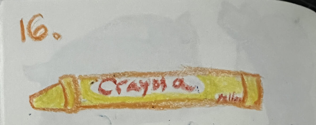
I started by creating a bunch of templates of 2.5 by 3.5 inches, the same dimensions as a trading card. I then began trying different layouts, placing on all the necessary elements to create a front and back of the ticket. I tried many variations, even experimenting with landscape and portrait layouts.However, these just looked like text on rectangles. They were not interesting, eye-catching and didn’t really sell a brand, they didn’t even feel related to the name and theming of Tickets to Connection. So I took a different approach and referenced my mood board more, thinking more about travel tickets than trading cards. I started blocking out areas to define areas and add graphical elements. Here I decided my prompts needed names, something that stands out and is more fun than the prompt only being referred to as a number. The format of having the prompt name and instructions on the front and communication points on the back worked well and fit the process of using the prompt, but the design still felt basic and unfinished.I decided to square off the corners and add the semicircle cut out that people imagine which quickly made it look like a ticket. This also made the layout and format I was using look even better. The next step was experimenting with how I was to make the design more interesting and unique whilst keeping each piece of text easy to read. I went back to my mood board and took inspiration from one of the circus tickets to create a pattern background for the prompt name. This was a good place to add visual interest because the text is larger, bolder and has few words in comparison to the prompt itself and the communication points.I then proceeded to do many iterations of the design with small alterations trying to find the best combination of elements, positioning and text size. Occasionally I would mentally shift back to thinking I was designing for a physical card which is where the QR code came in; the intention being users would scan the card to link to that cards web page for more information. Although I didn’t need it at this moment, the idea might be useful for when I do want the cards to be printed and it will allow more information to be linked to the prompt whilst only the vital information is actually printed on the ticket.I key development to the feel of the cards was adding a vector brush as the stroke of all the shapes. I chose a wobbly pen brush that stopped the edges being clean and sharp, which quickly added some personality to the cards and made them feel more related to the fun, creative and welcoming values Tickets to Connection is all about. By using a vector brush the whole ticket was still vector based and therefore can still be skilled for different users whilst keeping the same level of quality which is better than using an image to overlay a texture.As development progressed, I began using different colours. I stopped using orange all together and the shades of blue changed from my previously chosen shades to ones that worked more effectively with the design. My previously chosen colours may have made a good colour scheme; but they were chosen out of pure aesthetic and less so out of use and practicality. The darker blue didn’t change too much but the light blue became much lighter to have a stronger contrast. I also chose a vibrant shade of turquoise to a contrast colour. I also decided that I would use only one colour per theme of a prompt set, meaning the base set of Tickets to Connection prompts will be on blue cards whilst orange will be assigned to a different theme such as family or friends later down the line.Before deciding on final shades, I looked at a Pantone colour bridge. This is because colours look different on a screen as they do in print and not every shade is even available in print. This is important because these colours will remain the same even if there is a slight layout shift for the print version. I also plan on printing the tickets for my degree showcase which makes finalising colours sooner rather than later even more important. I looked through the bridge, finding specific colours I liked in both the CMYK and Pantone. I took pictures of the codes so I could make my final decision based on which ones also looked good or the right colour on screen.After deciding upon the colours, I added a shadow behind the prompt name, just to be sure that the contrast between the white text and the pale blue is enough for easy reading.


Building the Website
I went into the production of the Tickets to Connection platform mock–ups thinking it would be fairly quick; I would create a few pages with the information that could be clicked between and do the same with the app, building only a little on my past Axure rp skills. But of course it was impossible for me to just do the easy route and as I went along I kept making more and more elements work, pushing my skills and knowledge further and further and overcoming many bugs.A high-fidelity mock-up is a mostly working mock-up of a website or app with all of the graphic design added. For me, this means the website looks the way I would want the final platform to look like, but the more complicated integrations such as the store or unique user login that require hosting and/or an actual product to sell to work. Despite my limited experience in web development and code I aimed to get as many features running as I could and where I couldn’t, I still kept that stage in the user journey.Starting the high fidelity mockup and designing the backgroundI set up a new Axure file for the hi-fidelity mock-up and set it to be the right dimensions for an iMac that will be used to display the website in the showcase. I would love to look into creating adaptive views for a larger number of devices but due to the timeline of this project I was only able to do the one.I decided that having a single page website that people scroll through, with the menu for quick navigation, as this feels more like a journey. I wanted the background to flow with a gradient so it changed as the user went down. I experimented with lots of different colour combinations of my colour scheme, even testing orange which I later cut from the base colour scheme completely. I found that the using navy, or the turquoise was too vibrant for a background whereas the light blue and white worked really well and both had a strong contrast for using black and navy for the text and icons.


Creating the Menu Bar
With the menu redesign, I also had to decide what the sections were to be and what would go in them to decide how many buttons needed to be on the menu. I made a quick plan of this so I could get the menu set-up correctly and also keep track of where the content was going.I used a click or tap interaction so that the page would scroll to the correct point and set the state of the dynamic panel when they were clicked. Interactions are a feature of Axure where you can define what happens if a user interacts with an element in a specific way. I actually added the interaction to a hotspot overlaying the button to ensure it covered the whole area a user could click on instead of relying on them clicking on a small specific point. I also used mouse enter and exit to have the icon and its related text get bigger when the user hovered over them adding motion and visual interest to the design which also functioned as letting users know where they were hovering.I used dynamic panels (which allows a single element to have multiple states that can be set or scrolled through using interactions) so the menu could highlight which area a user was in once they had clicked the button. I tried different colours to indicate this and decided that the turquoise worked the best.


Fixing Menu Bar Bug
Each feature I added I made sure to test it as I went along to make it easier to fix bugs and to ensure issues didn't get duplicated when creating multiple interactions as this would lead to it taking longer to fix in the future. With testing, I found that the find out more button was not working andWhen using a preview window in a browser for Axure you can pop up a console where you can track the process of an interaction. This is great for seeing where an interaction doesn’t work as you can see each step being executed. I used thai to try and find the bug in the button and found it was acting as if there was no click or tap interaction for the button. I tried deleting and reading the iteration, making sure the hotspot was not behind anything but for some reason the fix was copying the interactions to a new hotspot element.

Adding Motion
When it comes to design, you need to assume your user has no idea what they are doing and needs to be prompted or directed for everything. So to encourage users to scroll down, I added an arrow to the home screen and made it wiggle once the user has been sitting on the page for a few seconds.

Button Style Effects
I wanted to make sure users knew when they were hovering over buttons so I used panel estates to highlight the buttons when the mouse hovered over them. I initially did this by using dynamic panels and having a state for highlighted and un-highlighted. To make it work, the mouse exit and enter interaction changed the state of the dynamic panel.After doing this for a couple of buttons, I remembered style effects existed. This meant I could add mouse over effects (when the cursor is hovering over an element) without the need for interactions and dynamic panels. This made the production process more efficient as all kept the interactions tab for the buttons much cleaner, making it easier to fix issues and make adjustments.


Tab Issue
Everytime I needed to test something I would hit the preview button in Axure and this would open a new tab in my browser. I did many tests, especially when making slight adjustments to placing and scaling which resulted in a lot of tabs and it became a bit of a problem, especially if I lost a reference or research tab within them.However, I discovered refreshing the page and updating the preview to the changes I had made. This made working much easier and I could run tests much more effectively.This discovery wasn’t very technical or super significant, but I feel finding the ways to improve workflow are really important in making work more efficient and enjoyable whilst also looking more professional.

Hover to reveal problem
I had set up hot spots across an image of the tickets to allow users to hover over that section to learn more about what it is or means. I used the hide reveal function, thinking this would allow for the most smooth transition of the text appearing and fading. But with testing, I found that if a user moved across multiple items quickly, multiple pieces of text would overlap each other. Even though a user would stop moving the mouse to read, it did not look good and made it feel lower quality. To fix the issue I switch to using a dynamic panel where hovering over a hotspot would cause the dynamic panels to be set to the related state. As a dynamic panel is a singular element, only one state can be shown at any given moment, therefore no matter how fast the mouse is moved across areas, only one panel of text is displayed.I also used the same technique with the key for all the icons on the cards, but allowed users to tab left and right to move between pages of the icons, which would change the text too.


Randomly occurring bug for flip ticket button
A bug I could never manage to fix was that occasionally clicking the flip the ticket button would also scroll to the top of the website. This was annoying but even with the tracking I could not see what was causing the issue.
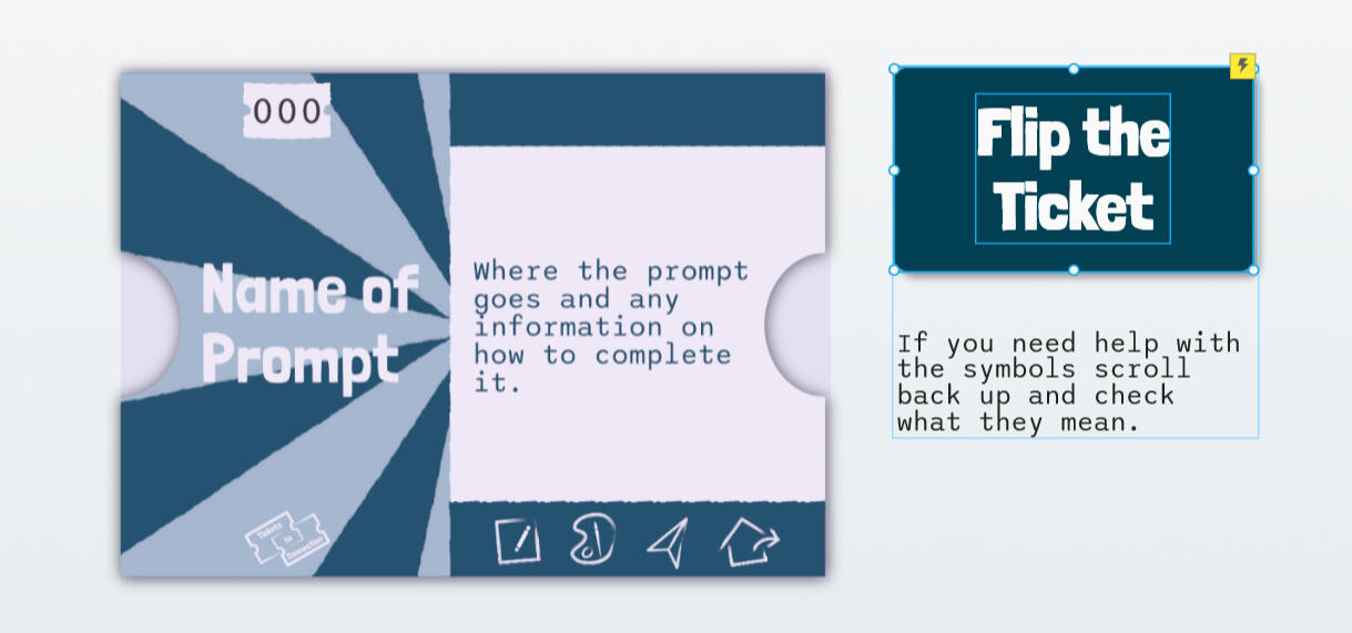
Font Mapping
I used the Axure cloud to be able to view the preview on another device so I could test if the layout on a mac screen was correct. It was not because I had completely forgotten that the search and toolbar of the browser would take up some space on the screen but I was quickly able to adjust this and shift everything to fit. But more importantly I noticed that one of the fonts I was using was not displaying on other devices because the font wasn't installed on that device.A temporary fix would have been to install the font on the device, but it wouldn’t work to have users download a font just to use a website. Instead, I had to map the font to the website. As I was using google fonts to ensure I was using a readable font, I was able to take the CSS code and embed it into the file in Axure. I did the same with the other font just to be sure it would show up on every device too.


Dynamic Panel View
I started creating the dynamic panels for the menu bar for the Your Journey section of the website when I learnt I could view all the states of the dynamic panel at once. This was another thing that made a massive impact on my workflow and it was so much easier to make sure all the states lined up correctly and I could quickly make changes across all states. Frustratingly, I could have noticed this way sooner but I still used it a lot going forwards.

Using Cases for Sign-In
I want users to be able to log in with their own account to keep track of everything they own, groups and progress towards badges. I used cases which are based around if statements, so that if a user types in a username and password it will "sign them in." As this is a prototype there is only 1 username and password and it doesn't change much about the experience.


Building the App
Layout & Navigation


Random Number Generator & Dice


Timer


Search Feature

To create the app I used similar tools in Axure as the website with their layout adjusted for vertical format and the menu bar becoming a navigation bar along the bottom like other apps. The prototype for the app is set to the dimensions of an iPhone 13 mini, as this is the phone I own and could therefore test this size the best.Due to the layout and user expectations, the app needed a bottom navigation bar instead of a menu. I looked at the navigation bars of apps I use to see the spacing of icons in the bottom navigation bar and how many they have. This is because I wanted to have 5 but that initially seemed too many. But I soon noticed multiple apps had 5 and the buttons are much smaller than I would have thought to have made mine, even if they had less the buttons were still the same size.I used white on navy to contrast a white background to keep the app mostly light. I still used the turquoise to identify which page the user was currently on as this gave a sort of greyed out look showing it wasn’t an option to pick to change page. Many apps use only very subtle differences to show which page a user was on so I felt this kept it consistent with other apps.
There are instances where a user might need or want to use a timer or generate a random number to complete a prompt or help choose one so I decided it would be useful to have these tools inside the app. However this required a bit more than just interactions, it required functions and variables. In previous projects I had used variables to store data and had a good idea where to start based on my basic knowledge of coding.I scrolled through the list of functions in the input and found random in the maths section and had this run when a button was clicked and then set a variable called “random number” to the output. This got me an output, just not a very useful one, as it outputs the function itself. I realised this was probably due to formatting, as placements on things like brackets are important in these sorts of things.So I did a bit of searching on the Axure website and found the correct formatting. This at least meant I got a numerical output, but it was a long string of decimals despite aiming for a number between 1 and 9. I found that adding math.floor might help in getting the whole number, Instead it printed the function itself again.I found a page about how to generate a random verification code for a security feature in Axure. I did some experimentation to see if I needed the entire function for what I was creating and quickly found to not be back to square one of the function itself being outputted, I did in fact need the whole function. But this finally worked and I was able to adjust the random number to be between 1 and 60, as this is the number of tickets currently available within the app and website.I then created a dice using the same function, but for the numbers 1 through 6. The output was then used to set the state of a dynamic panel which showed the respective dice face. The process of building this was much smoother and I already knew what the function needed to be.With both of the features now functioning I was able to add the visuals and make them fit within the app.
spacing of icons in the bottom navigation bar and how many they have. This is because I wanted to have 5 but that initially seemed too many. But I soon noticed multiple apps had 5 and the buttons are much smaller than I would have thought to have made mine, even if they had less the buttons were still the same size.I used white on navy to contrast a white background to keep the app mostly light. I still used the turquoise to identify which page the user was currently on as this gave a sort of greyed out look showing it wasn’t an option to pick to change page. Many apps use only very subtle differences to show which page a user was on so I felt this kept it consistent with other apps.
The timer needed a different set of functions and interactions and involved multiple inputs and a constantly changing display. As frustrating as it was at times, this was an interesting challenge to solve. To countdown in seconds I had the variable -1 when the page reloaded, an event that was fired (automatically setting off another “interaction”) after 1000ms (aka 1 second). I did have to research how to have the counter display in minutes and seconds because it involved more of the maths functions, but I was able to get it working.I added 3 options for timers that would most commonly come up in prompts, or useful additions to the challenge of a prompt. I would have loved to have users input the amount they wanted, but I struggled to see how to convert the input text of minutes and number to the seconds needed by the countdown to actually work. This is something I would definitely implement if I was to continue this project, as I would have the opportunity of unlimited time to research the more complex interactions and functions.
To be readable, the tickets needed to take up a much larger proportion of the screen than on the website. This made it much harder to scan the tickets to find the one you wanted. To solve this I added a search feature.This compared the text a user inputted to the title of a card in the repeater and added a filter to only show the ones containing the inputted text.This made it so much easier to find a certain ticket so I added it to the website too as there are a lot of tickets. I also implemented a search feature on the badge pages on the app and website to make it so users can search those too. Currently, there are only a few badges available but adding a search allows for the expansion of the badges without inconveniencing the users.
Bonus: All the courses I listened to whilst making these mock-ups
During the production of the prototypes of the app and website there was a lot of time where I was just placing elements, inputting next and ensuring the style was cohesive. I decided that instead of just watching youtube videos I would be a bit more productive and watch Linkedin Learning courses as these could help with transferable skills and boost my CV. I completed 5 different LinkedIn Learning courses and was able to complete the quizzes and earn the certificates.


User Testing
I got my prototypes peer tested by an online friend (hence the usernames) because I know where everything is and have looked at it many times, so it is easier for me to miss things like typos and assume that it is a good user experience.Set Tasks
I set a test for each prototype that required finding a piece of information, this way they would have a goal. I also left it open at the end to just give me any feedback on the rest of the prototype.

Notes
They completed the tests why we were on a voice call so they could voice their comments, and I took note of all the things that needed changing. There were a lot of small changes I just corrected at the moment, such as typos or kerning so text was readable. All these changes were things I had just become blind to after seeing it every day which is why it’s very important to have other people test and review it.

Changes
The bigger changes I made after the call had finished. I added a button below the shop to tell users to scroll down because my friend was disappointed there was no convenient button to scroll down like there was every other time.A change I couldn’t make was making a pause play button for the timer. I tried, but the way I stopped the timer was by setting the variable to zero so it could no longer count down which made it impossible to restart it. Given my limited skills I don’t see a way to implement this given the time frame.The biggest change I made was completely rearranging the How it works page. It was pointed out that all of the text on this page was tiny because I had to cram so much into it. This was not good for accessibility. To solve this I made it so users could toggle the icon information on and off over the top of the ticket information to save space and this made everything much easier to read.


Ticket Templates


I created templates for the Tickets that way each ticket can be made by just copying the information into the template ensuring all the tickets would be the same. At this stage I also designed 6 expansion colours schemes so the templates are ready to go.
Putting prompt list into prototypes


I put all 60 prompts onto the tickets in the collection section of both the website and the app, and checked if it was possible to search through all the new additions.I thought this task was going to take a long time as I thought I would have to transfer all the prompts, prompt names and each communication point individually. However, it turns out using a Google sheet for the organisation meant I could transfer whole columns at once greatly speeding up the process.An improvement I would make here would be to figure out how to get the communication points to format better so it matches the actual ticket template. Because the repeater just pastes the text into a single element and repeater tables can’t have new lines to make a new bullet point in a single input, I have to keep them spaced apart to ensure they never overlap. If there was a way for them to adjust based on text in other elements, it would look much better.
Making a Discord Server
Tickets to Connections aim is to help people connect no matter how far apart they are. But it could also help people struggling to find friends and connections. This is why I created a community Discord server to create a safe and welcoming space for people to make friends and share their art. It would also be an excellent way to give users early access to information about Tickets to Connection such as early access to the monthly ticket or be the first to see any news. Many people make long distance friends on Discord, myself included, and it is the best place to build a community where everyone is included and can talk in a semi public place so I feel a server would be excellent for Ticket to Connection.


I set up the server with a bunch of safety messages such as auto moderation to block inappropriate words, as I want the server to be a safe and welcoming space for all. The implementation of roles also meant trusted moderators can delete messages and ban people to ensure members not following the rules are dealt with.I set the icon and colours of the server to match the Tickets to Connection Colours to keep a consistent brand. The icon for the profile is also the one that would be used for the app icons, keeping a consistent brand by matching the pattern on the tickets themselves.
Designing Merchandise
An important part of Ticket to Connection is not pricing the product super high to ensure anyone who could benefit from it is able to buy it. To bridge the gap between the income from the product and the running costs of Tickets to Connection, it would be a good idea to sell branded products.I used product templates to design mockups of different products. I started out just placing the logo on different product but this just felt boring and kinda lazy.


I decided I needed a core design that was interesting and cohesive with the Tickets to Connection branding and visual style without being too over the top. I created a simple design that used the vector brush used in the icons and assets in the brand colours. These designs were transferable to a wide variety of products, even different base colours. I also kept the background of the products consistent to make it clear to see the brand they are related to. I changed up the design for the button badge to match the icons as it is small and has the same shape as a profile picture.


Production Files
The brand guidelines PDF and the Axure RP files for Tickets to Connection.
7. The Final Product
The website
*Note - This is a prototype designed for being used in chrome on an iMac. It is still functional on other devices, the page might not fully fit the screen
Final Product Mock-Ups


Website Pages - Main Site


Website Pages - Your Journey


The App
*Note - This works best viewed through the Axure Cloud app if viewed on a mobile device, as it designed for use without a browser bar. It does work opened in a desktop browser.
Final Product Mock-Ups


App Pages


App Icon


Ticket Design


Brand Guidelines


Merchandise
T-Shirts


Other Products


8. Reflection
This project is by far the biggest project I have worked on and one of the ones I am most proud of.Developing Tickets to Connection involved a lot of different skills and I feel I met my goal of learning new skills throughout this project. I learnt a great deal when it came to prototyping software and feel a lot more confident using Axure RP. The problem-solving element in Axure was what made it actually fun to use, because although it can be frustrating at times I am always looking for a challenge. I also developed my graphic design skills. The opportunity to create a full brand and learning what that involves, means I now know it is something I can offer as a service in the future heading into my career.I believe Tickets to Connection achieves my goal of creating a platform that helps people connect over long distances. The Tickets are fun to complete and help take the pressure off having a conversation whilst still helping to get people talking. The website and app support this goal by giving users a place to view tickets, track progress towards badges and purchase products from Tickets to Connection.Creating two separate prototypes within such a tight project timeline was difficult, and I am so proud with how they turned out. They both convey the concept of what Ticket to Connection would be if it was a launched app and website. I feel the visual style and aesthetic convey the creative and fun feel I wanted, making the brand not seem too serious. Creating the prompts was also more difficult than I thought it would be. I knew it would take time to come up with 60 unique prompts but I didn’t realise how difficult it would be and how hard coming up with the communication points would be. However, I am proud of the final list and the variety of different activities it has and really help Ticket to Connection meet its intended purpose. Finally, I love how the tickets turned out as these work great digitally but I could also see them being real life printed cards.Working on this project alone and starting out with minimal development experience limited me on how far I could go. The next step I would take would be to finish every page and element. Due to the time constraint, areas such as being able to actually enter a group and send messages or small features like pausing and restarting the timer were things I was never able to implement. A key detail I want to add is a way for users to mark a ticket as complete so it can count towards a badge, uploading a picture of the artwork for evidence. This is an important aspect, but as I have no way of hosting separate account right now it got overlooked.Tickets to Connection fills a gap in the market as there are few things to do when you can’t be with someone in person, especially when trying to avoid screen time beyond the video call itself. I am still passionate about taking this project into the real world and having it as a fully functioning product and platform users can buy and use. To achieve this I need to keep applying to get grants or investments and network to find people who can help because I know it is too big of a project to take on alone whilst also having a full-time career.If I was to work on a project of this scale again, I would plan to start the production phase sooner. I feel like I spent too long being indecisive in the early stages of development because I thought everything needed to be perfect to begin with. There are times when decisions do need that extra thought because the outcomes make a huge difference and would be difficult to change down the line, other times I need to stop other thinking and just move forward.Overall, I am still happy with the outcomes of this project and proud of what I was able to produce.
9. The Showcase
The cards and their packaging
About
Development Book
About
Printing the stickers & business cards
About
Setting Up
About
10. Where To Next
Looking into Professional Printing
About
Other Types of Cards
About
Convert Branding to Apparel?
About
Applying for Funding
About
Reflective Log
Weeks 0: 20/12/24
I have begun thinking about what I want to do for a major project and have decided on a project I am passionate about.With being in a long distance relationship, I feel I would personally benefit from having a product that makes things to do on call much easier so I think others would too. I found that since coming up with this idea I’ve not been able to stop thinking about it and I really want to start working on it which tells me this is the project I should take on. Furthermore, I feel as though I can use a lot of different skills developing it.
Week 1: 06/01/25 -
This week I moved onto expanding my idea and exploring all the things I could possibly do as part of this project. I used a mind map so I could write down as many things as possible so I had all the potential paths in front of me.By doing this I started to further expand certain ideas as well as expanding who this project could be for. With all the possibilities I then defined my goals for the project. The minimum viable product is the core parts needed for it to be usable in any capacity and the minimum I expect to submit. This includes a base set of prompts with card design along with the concept and visual design of the app and website.So far I am pleased with the progress I am making with the project and am excited with the potential the project has and how beneficial it would be to people.
Week 2: 13/01/25
This week I started to look more in-depth at different areas of research to inspire different areas of the project. This was interesting as I got to explore different ways media had been used in communication. I really liked the way Dear Data used physical media in sending postcards to each other which is something I want to inspire elements of my project as I really like having physical media.I started to look at names for the project as well as colours for the project. Naming the project is difficult because I want it to be reflective of what the project is whilst remaining short and easy to remember. A lot of words associated with the project imply that the project is for romantic couples only which is something I want to avoid.For colours I was able to decide on a colour scheme which will be really useful going forward. The colours feel welcoming and fun without being overly bright and obnoxious. With the blue being slightly more desaturated it gives a sense of warmth to it which helps with the overall feel.As the project involves a large amount of art prompts, I started a spreadsheet to keep track of all the prompts I think of so I don't have to come up with them all at once. Using a spreadsheet made it easier because I could list the prompt as well as all the other things that need to go along with it whilst being organised.
Week 3: 20/01/25
This week was an overall productive week. The deadline of the #ThinkBigARU competition was a great motivation to make progress on the overall project and commit to certain decisions. Also getting feedback from various groups of peers was useful in ensuring my idea and plan was clear.A large part of my week was spent working on the pitch video. Changing from describing what my project is to showing how it works in the pitch video was a big turning point in how I explained my idea and also how I saw the project. It made it much easier to visualise the project as a final product that is functional over just a concept.Making the pitch video meant I had to start to commit to certain visual aspects of the project. I didn't want to commit to full branding right now but deciding on a name and some colours was a good step in that direction and important to the video. By narrowing how I was going to organise the cards, I could choose just colours that are more personal which I like given my personal connection to the project. However, I needed to just do more than use favourite colours, I needed to find colours that would actually work as a brand. I found trying to find workable shades of each colour rather interesting, a bit like a puzzle of trying to find colours that worked well together but stand out from each other without being too bright to look at.I found peer feedback to be very useful this week as it helped me decide on the name for the project. Choosing a name felt like such a big deal and I was really struggling with it as I knew I would be committing to the name and couldn’t change it, unless I remade the branding. In the end I went with the one that got the most positive feedback from peers as this gave me reassurance it was the right choice.The peer feedback also made it clear that the prompts and discussion points need to be meaningful to stand out from generic prompts. This has encouraged me to start looking at art therapy and mindful art prompts.
Week 4: 27/01/25
This week I submitted my pitch to the #ThinkBigARU competition. With this I had to explain my business idea in only 500 words which made me figure out how to clearly explain my idea to others which first meant it had to be clear to me.During this process of writing my business outline I ended up changing the name of the project from Creative Connections to Ticket to Connection. I feel this change was necessary and I am glad I made the change. Tickets to Connection links better to what the product does for its users, calling the cards tickets emphasises that they are going to go on a journey using art to connect. The name also feels like it has more potential with branding and being able to link together things with the language used. Furthermore, it clashes less with already existing products and projects.Outside of completing the pitch I feel as though I wasn’t very productive as the project didn’t make much progress. I feel like I need to put more effort into blocking out time to work on my project rather than working on little bits when I feel like it. This will also involve setting myself some false deadlines and getting someone to make me accountable for them.
Week 5: 03/02/25
This week I attended a lecture from a board game developer. Although I am not making a board game, the process we were shown helped me understand the process of designing the correct layout and made me realise that not everything will feel 100% perfect to begin with but is still the better choice.I decided I was in need of some creative exploration. A large part of Tickets to Connection is getting people to be creative, and this needs to shine through in the branding. It was good to just be free thinking whilst just working with various art supplies.
Week 6: 10/02/25
This week was a big focus on branding development. I made progress in developing the logo and the identity of Ticket to Connection which is an important foundation for lots of different areas.
Week 7: 17/02/25
I started on creating the prompts list this week as I need so many and starting it now allows me to work on it in the background.I also want some other opinions on my project so I launched a feedback form which makes it easier for people to leave feedback.
Week 8: 24/02/25
This week marked the beginning of pre-production with the establishment of wireframes for the platforms. I find wireframes and user journeys a good way to visually see how a user might navigate or interact with a digital experience, instead of trying to imagine it in my head.Doing research into UX/UI design was also important to help make sure I create a good experience for people using my app and website that makes them want to come back, not one that makes them leave in less than 10 seconds.
Week 15: 14/04/25
This week I actually felt like I was making progress and that completing my goals of having a working prototype that is able to convey the concept of the Tickets to Connection platform. I was able to get the foundations of a website (menu navigation, basic layout and core elements) working in Axure RP which was a lot of progress. I always find getting started difficult because I find it hard to find the point to jump off from but now that I have the beginning of an actual product I can feel everything coming together.
Week 18: 05/05/25
The final couple of days were quite stressful as I tied up all the loose ends. I want everything to be perfect, but because of that I struggle to allow things to be finished so I am always working till the last moment.
References


Skills Audit
University Centre Peterborough
| Year | Module | Skills Used | Outcomes | What I learned | What I Would Like to Learn |
|---|---|---|---|---|---|
| 1 | Digital Animation | • Adobe Animate • Animation Basics •Timings •Lip sync • Keyframing • Storyboarding | • Lip sync to provided audio •Short walk cycle • Animated Logo • 2 minute animation using only found assets • A scene that portrays an emotion | • Basics of Adobe Animate and Digital Animation • Learn how to lip sync in Adobe Animate to a spoken piece of audio | • More in-depth skills related to animation specifically those that relate to the feel of animation rather than technical aspects of software. |
| 1 | Digital Asset Design | • Adobe Illustrator • Adobe Photoshop • Adobe After Effects • Affinity Publisher • Asset Design • Designing promotional material • Blender 3D • Brand Requirements | • Vector Logo • Vector App Icon • Sprite sheet of interface icons • Marketing Images • Full-page print advert • Advert banner suitable for web • 4 fully textured 3D game assets • Presentation for peer feedback • Critical Reflection | • Basics of Blender 3D • The requirements of using the app store and google play logos in advertisements | • More in-depth use of Blender 3D |
| 1 | Photography | • Adobe Photoshop • Affinity Photo • DSLR Camera • Photo Editing | • A series of 7 image related to a chosen theme. | • I learnt how to comfortably use the manual mode of my camera • Learnt composition and lighting within photography • I learnt the basics of editing RAW photo files in Photoshop. | • I want to get better at editing photos and establishes some sort of style within my editing. • Explore photography more and gain a more natural sense of composition •It would also be interesting to possibly do some more related to advertising especially with the focus on making it more creative and fun. |
| 1 | Critical Theory in Art and Design | • Essay Planning • Academic Writing • Academic Writing | • 600 word essay plan • 2,400 word essay | • How to structure an academix essay | N/A |
| 1 | Introduction to Creative Industries | • Debate Skills •Academic Writing • Working in Groups • Time management • Planning and scheduling amongst multiple people • Quick thinking when faces with unexpected debate outcome | • 500 Word Academic Paper to support debate •Debate done in pairs against another pair with at least 5 minutes of speaking per person • Portfolio showing professional development in the industry. | • How to structure a debate and how to take part in a debate. | • To be able to expand the persuasive words into non-academic non-written settings, such as being able to use it within advertising. |
| 1 | Website Design | • Microsoft Axure • Graphic design • UX design • UI design • Wireframing • Prototyping • Design for accessibility • Illustration • Following an art style • Procreate animation • Frame by frame animation | • A working (within client hosting limits) website for a children’s book with integrated learning resources. | • How to use the basic tools and functions within Axure. • How to create a wire frame for a website. • How to create and test a prototype of a website • How to use online tools and user testing to ensure a website UX and UI meet accessibility requirements. • The importance of good UX and UI design | • I would like to continue building the graphic design skills relating to web design to give me more transferable skills within the industry. |
| 2 | App Design | • Microsoft Axure • Graphic design • UX design • UI design • Wireframing • Prototyping • Brand Creation | • Mock-up app with some level of working features • Portfolio showing development | • How to use more advanced features of Axure • That app design is hard for me and that app UX design is not a career path I'm interested in. | • I would like to continue developing skills in building brands, such as colours, logos and related touch-points as this was the most interesting part of this module for me and I feel like it would be the most useful skills within my career. |
| 2 | Computer Games Design | • Team Work • Asset Design • Wireframing • Beat Chart • Level Design • Pitching | Working in a team: •Design a game with clear game concept and create concepts for 3 or more levels. •Pitch for game (as though pitching to a game company) • Game design document showing game development | • The basics surrounding the development of a game. • Understanding of player types and player retention. • Understanding of game design psychology such as positive and negative reinforcement. • What a beat chart for a game is and how to create and use one. | • I would like to develop skills in concept art in more depths and build upon my art skills as this is also important in other parts of the creative industry such as film and animation. |
| 2 | Critical Practices in Art & Design | • Essay Planning • Acadmeic Writing • Academic Referencing | • 3,000 word essay | N/A | N/A |
| 2 | Intergrated Advertising | • Team Work • Photography • Animation • Graphic Design • Adobe Suite • Affinity Suite | Intergrated Advertising campaign for a collaboration between Nene Park and Liv Bikes consisting of: • 10 Second Pre-roll ad • Social Media Ad • Pop-up Display Design All presented in a 45 minute pitch to representitives from Nene Park and Liv Bikes. | • What an integrated advertising campaign is and the different elements that make up a campaign. • The different types of advertising and the pros and cons of each method. • How to create and present a pitch to clients or higher-ups within a company. | • Despite being one of the most stressful modules I have ever worked on I really enjoyed the idea of making a creative advertising campaign that covered lots of areas. I would like to build more on the graphic design and idea generation skills surrounding advertising. |
| 2 | Professional Practices & Development | Work Placement: • Working with client • Photography • Social Media Content Creation Exhibition: • Team Work • Communication within and outside of the team • Idea geneeration and discussion • Exhibition planning • Networking and working with artists • Curating artwork • Working with media teams • Website managment • Dealing with and fixing unexpected issues | • 100 hours of work placement with blog to show completed work and skills gained. • Personal Website, branding and CV • Exhibition planned and hosted by the class with documentation of the journey to the exhibition. | • How to work with a team over a long period of time working a particular role with certain tasks to complete. • How to plan an event and run an event as part of a larger team. •How to run a small art exhibition. | • I want to improve and solidify my on personal brand. It is been constantly changing since long before I even started this module but I would like to start keeping it consistent and creating touch-point that would help me build my network such as getting my own business cards. |
Anglia Ruskin University
| Year | Module | Skills Used | Outcomes | What I learned | What I Would Like to Learn |
|---|---|---|---|---|---|
| 2 | Immersive Storytelling | • Eko Basics • Twine Basics • Use of 360 Cameras • Use of professional video and audio recording equiptment • Scriptwriting • Storyteling and narrative creation • Team work and collaboration • Working with actors • Video editing • Overview of the production process of a short films | • 3 Narratives using immersive storytelling software Shortfilm: • Storyboard •Story beats • Script • Production Schedule • 5-10 minute short film •Blog documenting production | • The process of creating a short film from idea to final product including which areas I enjoy working in most. • That I do not want to work directing a film or take leadership roles. | • I would like to gain better skills in using video and audio recording equipment. • Become more confident and efficient in editing video and audio to be able to create better higher quality edits whilst still completing the project within a reasonable time frame. |
| 2 | Graphics in Motion | • Adobe After Effects • Green Screen • Motion Tracking •3D Camera •Time Managment •Procreate digital art •Procreate digital animation •Creative thinking and problem solving •Frame by Frame animation | • 2 animation, one to a podcast segment one two music. • Blog showing development of skills and production | • How to motion track, use 3D camera and use key lighting to green screen in After Effects. • The development and production cycle of an animation. | • I really enjoyed using the 3D camera in After Effects and would like to do more work with that and really push the limits of what can be done with it. |
| 2 | Ruskin Module: Do I Matter | • Reflective thinking • Creating connections •Academic referencing | • 15 Slide Power Point discussing and aspect of myself, how it is reflected in media with quotes. | N/A | N/A |
| 2 | Critical Issues and Debates | • Academic Writing • Researching • Academic referencing •Backing up and argument • Reflective thinking | • 2,000 word essay • Visual Essay | • What a visual essay is. • That Frida Kahlo is a Bi Icon and that periods of history erase queer history. | N/A |
| 3 | Working in Creative Industries | • Report Writing • Time managment • Professional Communication • Graphic Design • 3D modelling • Animation • Planning and Visual planning | • 100 hours of industry related workplacment • 3600 Reflective Report on Placement • 2400 word diary of work placement | • Managing multiple projects and tasks at the same time. • Self-motivation to complete work and tasks in a timely manner • Exploring software not designed for art for art and education. | • Better understand how to set personal goals and deadlines if client deadline is not clear. • How to connect and work with clients who share the same values as myself. |
Experience: Jobs & Exhibitions
| Project Name/Job Role | Skills Used | Outcomes | What I learned | What I Would Like to Learn | |
|---|---|---|---|---|---|
| Exhibition | Exhibiting Photogrpaher, Photography and Art Exhibition at Shuttleworth | • Photography with DSLR camera • Composition • Colour theory • Editing RAW files • Exporting photos | A selection of photos taken of the Shuttleworth Museum and Gardens displayed at an exhibition at Shuttleworth. | How to edit a series of photos to professional quality in a consistent style and ready for print. | To develop a more stable style within my photography and editing which will make my work more memorable and engaging. |
| Work | Creative Producer, The Fitzwilliam Museum | • Communication • Idea generation • Creative thinking • Analysing artwork • Event Organisation • Event photography • Working events • Completing research questions • Working with a museum | Plan an event surrounding the Venus & Mars Botticelli painting being in Cambridge that encourages young people to be interested in art and encourage anyone to interact with the museum. Take part in research chats for a PhD student who is working with the museum to research of people interact with museums. | I learnt about the different roles working in a museum or working with important artwork and all the work that’s goes into restoration, conservation and curating artwork. I learnt about different ways to think about or explore a painting. I had some insight into event planning with a large group of young people from different backgrounds. | Explore more about implementing other areas of art into the art gallery experience and how to make it more interactive and immersive. |
| Exhibition | Get the Gossip, The Fitzwilliam Museum | • Photography • Helping Visitors to the event | Photographs of visitors experiencing and enjoying the event and exhibition. | How to take photos of people naturally enjoying the exhibit whilst also respecting ther privacy. How an event for an exhibition is run and the roles involved in the day. | I want to be a part of organising and running similar exhibition events in the future and learn about the more behind the scenes roles when it comes to moving and setting up famous artworks. |
| Work | Graphic Designer, ARU Employability Team | • Professional Communication • Microsoft teams • Illustration • Design process • Comprehension of brief and assigned tasks • Teamwork | Posters, web banners and website tiles to be used by the Employability team for the Elevate your Future campaign. | I learnt how to work on creating a cohesive style with another artist working a different role (animator) to produce final products that work effectively together as the same campaign. | I would like to further develop my skills of working in professional environments such as meeting deadlines, managing my own time and working with little to no supervision as well as receiving and taking on feedback to meet the clients needs. |
| Work | Digital Artist and Animator work Placement, NA/Films | • Creative thinking and idea generation • Communication • Time Management • Concept art • Digital Art • Blender 3D • Multitasking | Involvement in an Instillation for Natural England. An animation of a horse walking conveyed by footprints for Raby Castle. A 3D recreation of a Bronze Age settlement in Minecraft for Must Farm | Being able to effectively manage by time to be able to work on multiple projects at once. Ability to complete task efficiently and keep myself on track. | I would like to improve more on my time management and keeping myself on track. I was not given very strict deadlines which made it easy to just keep pushing off the work. |
| Work | Sports Communication Officer (Graphic Designer), Team ARU | • Designing social media posts • Graphic Design • Social media scheduling (Hootsuite) • Caption writing • Professional Communication • Photography • Photo editing • Affinity Suite • Canva • Microsoft Team • Microsoft forms • Managing multiple tasks | Designing social media and printed advertisment for Team ARU about the sports teams. | How to manage multiple projects at once Communicating within a team to acquire necessary information and meet deadlines. How to use Canva & HootSuite |